Digit Magazine, Under the covers
Jan 2005
"GREAT COVERS come from great content,” says Gill Hudson, editor of Radio Times, which shifts 1.1million copies a month. “Stop obsessing about covers right now. Covers are scary. Rules make everyone feel safe – but playing it safe is the most dangerous thing you can do.”
At a talk given to the Periodical Publishers Association (PPA) in May 2004, Hudson argued that cover design ‘rules’ have led to a “tidal wave of homogenous covers.” She added: “We are being market researched to death – define yourself by your difference”.
So what makes a great cover? How do you make sure you’re different, and get it right?
Read the full illustrated article here. Or continue...
Andy Cowles, creative director at IPC should know. “It’s a sense of event,” he says. “That something has happened that you have to pay attention to. Some measure of revelation.”
Back in the 1800s magazine covers were covered in type and perhaps accompanied by a symbolic illustration. The 1844 copy of Mother Magazine, for example had an engraving of a fountain on it – the source of life.
By the early 20th century, magazines had started to experiment with illustrations, and this led to a classic of magazine design. The poster cover was so called because it could stand on its own as a poster. At its simplest, the poster cover was a beautiful illustration framed by the masthead at the top and a tiny cover-line at the bottom.
“From the 1890s to the 1960s, the poster cover dominated the magazine field,” says Gerald Grow, professor of magazine journalism at Florida A&M University. “It is sometimes seen as the standard against which all other covers must be measured.”
Jeremy Leslie, creative director at John Brown Citrus Publishing, and part of the team behind the award-winning Carlos, agrees. Carlos, which won Best Magazine at last year’s Magazine Design Awards, was deliberately designed to fly in the face of current trends.
“That was definitely a simpler age. In the 1960s covers acted more as posters advertising themselves – they were more idea-based than rule-based. Carlos looks back even further, to covers like those early issues of Vogue – art-driven,” says Leslie.
In parallel with art and idea-driven covers however, magazines were experimenting with type. And by the 1960s, poster covers had given way almost entirely to the new kid on the block, colour photography.
By the late 1960s, type was taking up more and more space, obscuring models with cover-lines shouting at the reader to check out the magazine’s contents.
As technology and fonts developed, designers experimented with type. “In late 1972,” says Grow, “before discovering how to use the full strength of new fonts, Vogue even underlined some of its cover-lines in three different colours. This highlighted the urgency and emphasis.”
Now, the only thing limiting what’s on the cover is the restraint, or lack of it, of the art director and editor.
The rule is…
“Astonish me!” was the command of legendary art director Alexey Brodovitch. Brodovitch laid the foundations of modern magazine design 60 years ago when he worked on Harper’s Bazaar in the 1930s and 40s. He created magazines that did exactly that: astonished the reader. And he defined the role of the modern art director.
Since then, the art director has evolved into three types says Horst Moser, author of Professional Magazine Design: “The artistic art director; the virtuoso editorial art director and a third, special creature whose decisions are all heavily influenced by market research.”
The first is a genius whose work will stand on the strength of their name alone – Brodovitch for example. The second is like the conductor of an orchestra, blending type, photography, colour and so on. The third is a machine, chained to a Mac, unable to break out of his templates.
Over a career, most designers will experience a taste of all three, so writing ‘rules’ for front cover design is difficult – it’s called creativity.
But all agree there is one law above all else: “The fundamental thing is for the cover to sell the issue,” writes John Morrish, author of the book Magazine Editing. Even if it’s not on the newsstand, the cover has to sell the magazine to the reader.
“Everybody has their list of cover rules,” says Leslie. “If you listened to them all you would find many are contradictory. Many just reflect a prejudice – my favourite example was ‘never feature black people on the cover’. Such a rule can’t be taken seriously.”
The editor of market-leading women’s magazine Glamour – which sells 605,000 copies a month - Jo Elvin, agrees: “Rules? I probably do but they’re subconscious.” She adds: “For Glamour, it’s really bold colours, lots of coverlines, which let the image breathe, big numbers and big type.”
Leslie’s guidelines are similar: “Things that are generally considered true are: logo always at the top; don’t use green type; use numbers in the coverlines; align key text to left; big smiling women equals women’s interest; bikini equals mens’. Liberal use of the word ‘sex’ is vital.”
Cowles at IPC, has a wider take on it. “You have to know your reader and what their expectations are,” he says. “You must match presentation and material closely to the readership.” In other words, don’t design your scandal magazine to look like Vogue.
“You must be very focused. Clear statements. Combine words and pictures to produce a compelling promise … if you’re talking to the right person, it can’t be ignored.”
Despite what publishers and editors might say, the fact is there are no hard and fast rules, just experience of what works for your magazine – what sells – and trends that ebb and flow.
Even Comag, which distributes 21 per cent (or 250-300 of the top titles) of the magazines in the UK doesn’t know. Back in 1990 they carried out an oft-quoted survey. The results said the picture must be clear and not crowded, there should be five cover lines and that bright colours are better than dark. In other words, it should look nice. Unfortunately, the survey wasn’t comprehensive – out of 200 questioned only 15 people were interviewed in any depth.
Perhaps more useful is Morrish’s assessment that a good cover has: “A sense of confidence and strength.” But, he says, paraphrasing William Golding’s famous quote about the movie industry, “as to the means used to achieve that effect, it is almost the case that ‘no-one knows anything’. Any attempt to follow a formula is wrongheaded.”
Logo
In saying that, there are things you need to think about. The logo, or masthead, for example, must be at the top, so it can be seen on the newsstand. It should be recognizable when only half visible, and according to Morrish, “have a visual impact from at least three metres,” so it can spotted in WHSmith.
“Almost invariably it stays the same,” says Morrish. It might change colour and position, or drop behind the cover image, but: “On the cover it should stay in one place and remain completely visible for maximum recognition. If this isn’t vital, you can be more experimental.”
Image
And there is the cover image. “For Glamour, it’s about who is on the cover. A good cover is an A-list star. Or it might be someone less well-know, but who will give something more. Like Rachel Stevens wearing nothing but daisies,” says editor Elvin.
But she warns: “It’s no longer enough to put a celebrity on the cover. You need a great image and you need to have a great story to back it up.”
Anne Braybon, art director at Management Today agrees: “Great design is an intelligent response to editorial – the whole thing should work as a cohesive package.”
Content is King
That is, the image has to reflect the content inside. How you do that depends on the magazine’s style, voice and attitude – women’s magazines have different considerations to business-to-business.
However, all magazines should observe at least one simple rule, says Morrish: “The cover image must work at a distance – about three meters. That’s why so many magazines opt for a face looking straight at the reader.”
But there are other options. Illustration, caricature and montage, for example.Photography looks good if properly commissioned, but can be jaded and old-fashioned if using free or stock pictures. Illustration can be impressive, but it’s difficult to keep up the standard – the same goes for caricatures and montage.
“We have a very strong relationship with our illustrator, Jonathan Schofield,” says Carlos’ creative director, Warren Jackson. “This is invaluable in maintaining consistency for the look and feel from issue to issue.”
Leslie agrees: “Each magazine needs a consistency to its covers.” So the rule is, develop a style and stick with it. But, Leslie laments, “Everyone does the same thing today, with minor variations for individual markets.”
Cover stars
That complaint is a common one: “They’re all infatuated with the idea that celebrity sells magazines,” growled US designer George Lois on a US radio-show early in 2004.
Lois, who also resents the trend towards “skin” covers – those showing lots of flesh – was responsible for numerous classic Esquire covers in the 1960s. He was flying the flag for the lost art of “big idea” covers from his glory days; Andy Warhol drowning in a can of Campbells tomato soup, that kind of thing. “The best covers ever,” agrees Glamour’s Elvin.
But according to designer Michael Bierut writing in Design Observer last year, their decline might not be such a bad thing: “In the 60s the bracing clarity of the ‘big idea’ school of design was fresh. But eventually the cadences of the big idea, the visual pun, began to seem not just brazen, but crass, with all the subtlety of an elbow in the ribs. You can only have your rib poked so many times.” Magazine images now should, “entice, not arrest; seduce, not shock,” argues Bierut.
What’s the big idea?
Cowles at IPC agrees: “Those covers were produced by an ad-man, not an editorial team. It was a different time, a different age when the cover was used as social documentary and political statement.”
The big idea cover is not dead yet though – witness The Economist’s “Bliar?” cover of June 2003, which encapsulated in a word and an image the world’s questions over Prime Minister Tony Blair’s honesty.
However, Lois had a point about celebrity – and flesh. The trend for celebrity covers in a state of undress seems unstoppable – hot celebrities equal more sales goes the theory, but there is a danger. “There are only about six to ten celebrities that sell magazines in any given year,” says Susan Ungaro, editor in chief of Family Circle (US). “Sooner or later you look too much like your competitors.”
Elvin agrees, although Glamour always features a celebrity on the cover she says it is the whole package that sells: “I can’t use celebrities to distinguish [who sells best] because I’m very lucky, people just love Glamour at the moment.” Although she does admit: “Jennifer Aniston shifts covers like nothing else”.
Interestingly, women’s magazines rarely feature men on the cover, and while men’s magazines in the UK started out in the 90s featuring men on the cover, they soon switched to women. Now young, barely dressed, female celebrities on the cover of GQ are standard.
There are a few other ‘rules’. One face is good, two ok, groups best avoided, say the American Society of Magazine Editors. That’s because unless the group is a band and they can fall over each other, it will look like a school photo.
Newsworthiness is important for some magazines – the founding editor of People magazine didn’t put Elvis on the cover when the great man died and has never lived it down. “Nothing is better than the celebrity dead,” says Richard Stolley, now an advisor at Time, who lists “Lennon and Diana” as People’s biggest sellers.
Aside from that, great cover images it seems are more alchemy than science. Elvin agrees: “It’s gut instinct. There’s usually one where we all go, ‘That’s the one’.”
Type
If cover image is alchemy, then type is meant to be science. Since the 1960s type has gradually invaded the magazine front cover. Cover models are posed in coiled, energetic positions with acres of space around them for the words.
“People have become ‘repertoire buyers’, selecting from a range of titles,” says Morrish. Elvin agrees: “Readers aren’t loyal – you need coverlines to show the varied content inside.” There are exceptions: style bibles like I-D and many news magazines often rely on their brand.
While editors stress about the ‘rules’ for coverlines – short; to the point; no questions (it invites a negative response); no puns; 80 per cent should appeal to 80 per cent of the readers (“Single women’s sex survey” is useless if half your readers are married); big numbers (odd is better than even); Sex; Win; Free; be positive not negative (“Get tanned and gorgeous”, not “How to avoid sunburn”) – designers need to think about how they look.
The question to ask is “what is the point of them?” says Morrish. “With the exception of the main line they are not there to label things that are apparent to the reader. They are there to tempt, intrigue and invite.”
“The main line needs to be visible at the usual three metres,” he says. “The others need not be so big, but must be clear.”
There are any number of typographical treatments available. Some magazines use a heading and standfirst style for example: “Nicole Kidman: My split with Tom”. “This can be both clever and informative, but needs complicated typography and should be accompanied by a reduction in the number of coverlines,” says Morrish.
The big five
And as to number, Morrish agrees that five is enough: “no one will read more than that on the bookstall”. Some magazines though, notably in the women’s sector, have many more he says. “This is a calculated decision based on studying the way readers choose between what often seem to be identical magazine packages.” In other words, it’s market research.
Market research is not design though, says Leslie, who admits he has the luxury of designing customer magazines. “‘Oh dear,’ applies to just about every newsstand title out there. They are more about science than art, and it’s about following rules to achieve sales. Rarely is there a cover that breaks out of the normal template.”
Cowles disagrees. Once art director of Q, Mademoiselle in New York, and Rolling Stone magazine, he is now in charge of 90 magazines – all competing at a fierce newsstand. He is positive about magazine covers today. “Forty per cent of magazines bought were launched in the last ten years,” he says. “Magazines are of the moment. The Golden Age of magazine design is right now. Everything else is nostalgia.”
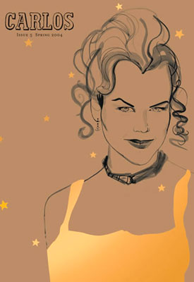
Carlos magazine
Magazine of the Year at the 2004 Magazine Design Awards, Carlos is the in-flight magazine for Virgin Upper Class passengers. Art Director Warren Jackson says: “The brown card cover-stock and hand drawn illustrations act as an antithesis to bland photography with star approval. We want to offer something that is tactile, personal, welcoming and stimulates readers to open up and read.
“Nicole Kidman has so many different looks. We went for a classic, semi-flirtatious Life magazine Hollywood look. It was the first issue we used gold foil-blocking and the result, while direct and simple, captures her, and all she is about, very well.”
The Economist
“Abu Ghraib was emerging on the Monday, building in intensity. It was a personal, emotional reaction of mine. I came in on the Wednesday morning and thought, ‘Christ, this man must resign’. We designed it very fast,” says Bill Emmott, editor of The Economist, about why this is his favourite cover.
“It epitomises what we try to do: Put across our point of view in an unmistakable and jolting way. We support the war, but it marked a turning point in our political position.”
The Economist’s covers are an excellent example of using a cover to make a political or social statement. But Emmott is not consciously thinking of that design heritage when the cover is designed.
“I think the best covers are always very simple and clear,” he says. “A great cover combines that clarity with a really strong, provocative point of view that jolts the reader into thinking actively.” The covers are most effective he says, “when we feature one single issue prominently. We have four taglines by the logo, but they’re subsidiary.”
Thirty per cent of the one million copies sold each week are on the newsstand, and a great cover combined with big news sends sales rocketing. “September 11 trebled our US newsstand sales,” he says, “Diana increased it by over 50 per cent”. More usually, a powerful cover will see sales rise by 20 per cent.
Glamour
This is Glamour editor Jo Elvin’s favourite cover. “It’s the A-list star, but as you've never seen her before. Before this picture, the most familiar image of Christina Aguilera was bleached-blonde hair and leather chaps.
We weren’t responsible for dyeing her hair red but we did style her in a way that we think the Glamour reader would like to look. It was all about very feminine dresses, and soft, sophisticated make-up. Christina loved the dress so much she wore it home from the shoot and straight out to a party that night.
“I also like how, while there’s a lot of type on this cover, there are still plenty of points of ‘breathing space’ so while it looks very commercial, I think it retains some sophistication.
The coverlines represent some of the major subjects that prompt our readers to buy – they’re fascinated with plastic surgery these days.
Lastly, this was a commemorative issue, celebrating our first Women of the Year Awards. It was fantastically successful. So I feel a special sense of achievement whenever I look at this cover.”


0 comments:
Post a Comment